Are we screaming for 'Quiet Luxury'?
So we are all used to Interior Design trends, and I believe there are always several going on at one time. You’ll see as many maximalism interiors splashed across Instagram, as you will minimalism and ‘rustic chic’.
Quiet Luxury seems to be a popular phrase and many of our Residential projects have been regularly associated with this. I think it is a nice description for residential interiors as so many of our clients now are not interested in being too showy or appearing extravagant, whilst still wanting to maintain a sense of quality and comfort.
Where our hospitality interiors need to be theatrical and often exquisitely bold, most of our residential clients come to us looking for calming spaces as of course most people want a very different experience when they go to a bar or restaurant than in their home. Quiet luxury seems to describe elegant spaces, that don’t shout for attention or give the impression of showing off and they also require an incredible sense of comfort, which for many, is the ultimate luxury. I remember a client once describing to me a satin chair that they had bought impulsively, ‘It looked so lovely in the showroom, but as soon as I got it home I realised I’d never sit on it because it was solid and too small and I’d be too petrified to ruin the material’ The very opposite of luxury on every level!
When we’re designing a space, it really is about identifying the needs and the lifestyle of our clients. We always start with function in terms of their day-to-day time in the space and then playing with positive and negative space is really important to give a sense of air and flow. I like to create a room with lots of space and combine it with a cosy reading corner to play with the different ways you will entertain and then also have down time. Also working with natural light is critical as you will so often be drawn to different spaces in a room or property depending on the natural light and time of day.
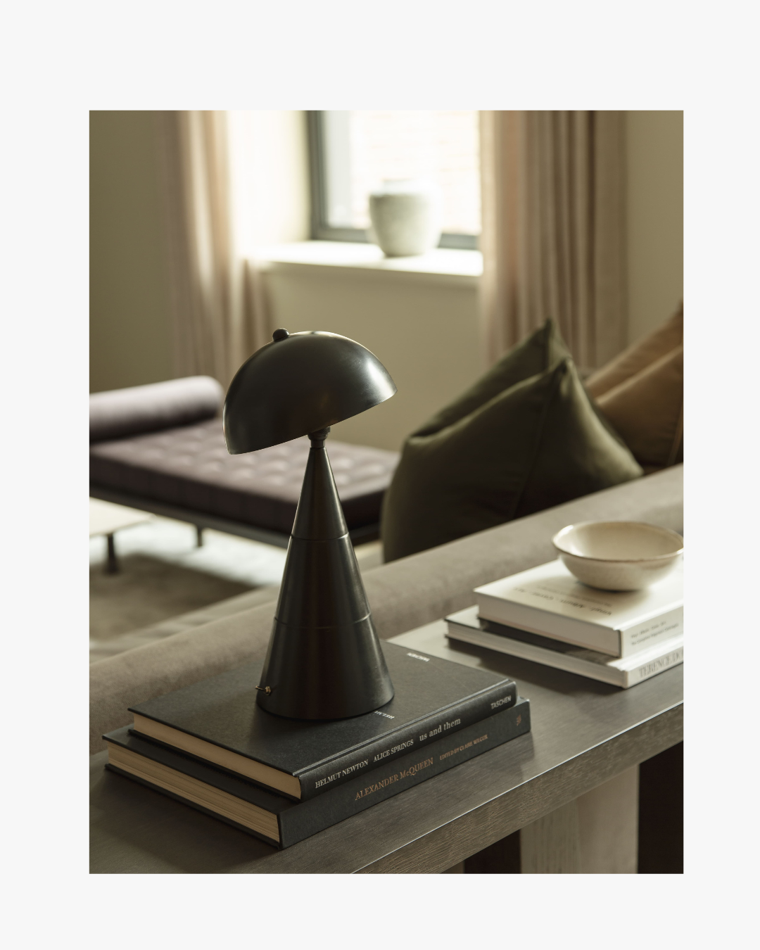
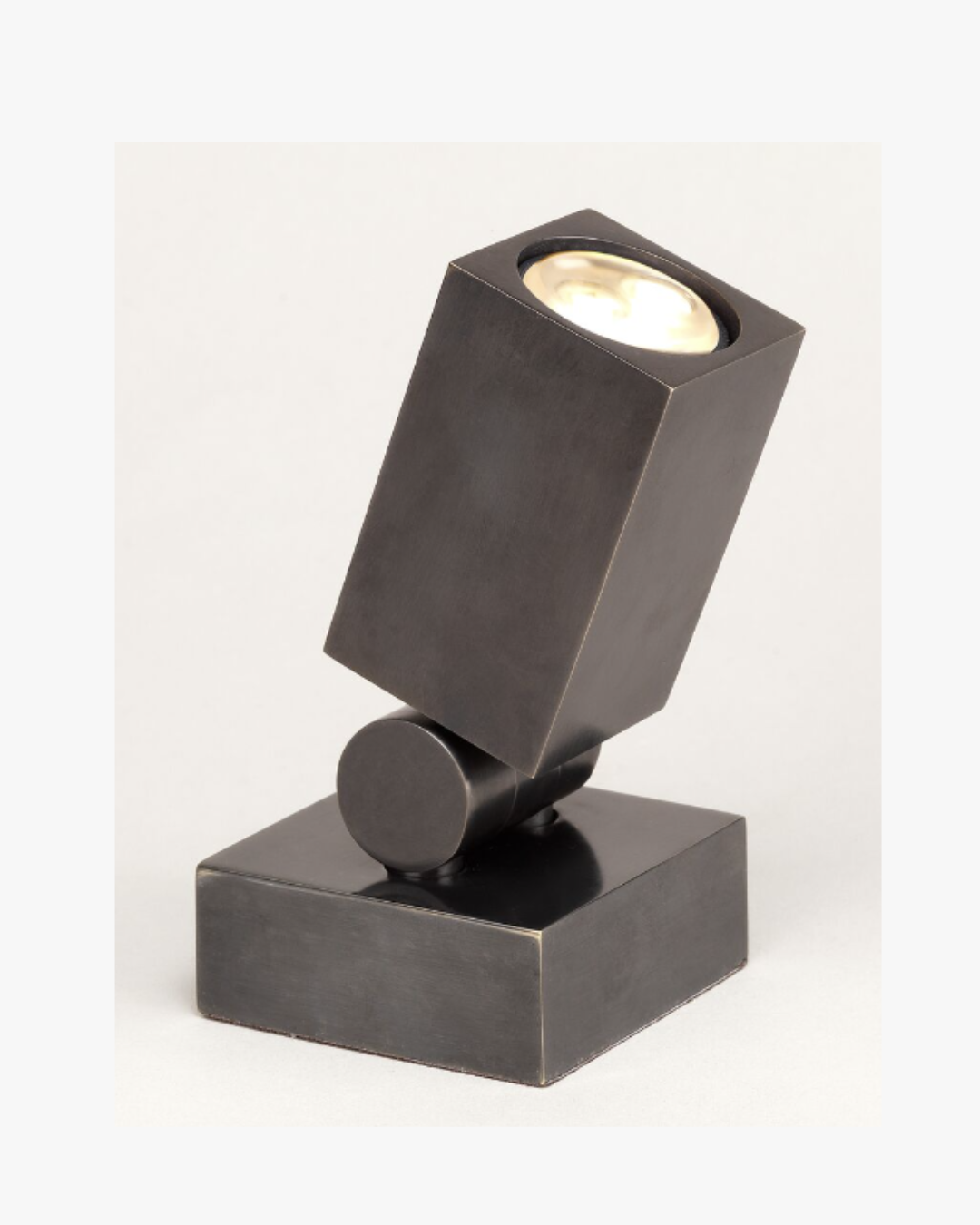
Ambient light is the next priority; whether we’re doing a full refurbishment with an entirely new lighting design specification, or working with what we have, getting this right is imperative to how our client will ultimately feel in the space. It doesn’t always have to be complicated and there are lots of decorative lights than can be cleverly positioned to create an ambient glow. We have sometimes had situations where there is no option but to add additional power and then we often use wireless lamps, of which there are quite a good selection. Here, we use one from Anna Lari but Pooky Lighting also have a great variety. We also love these plug-in spotlights from Vaughan Lighting that can do wonders in a corner uplighting some foliage or joinery.
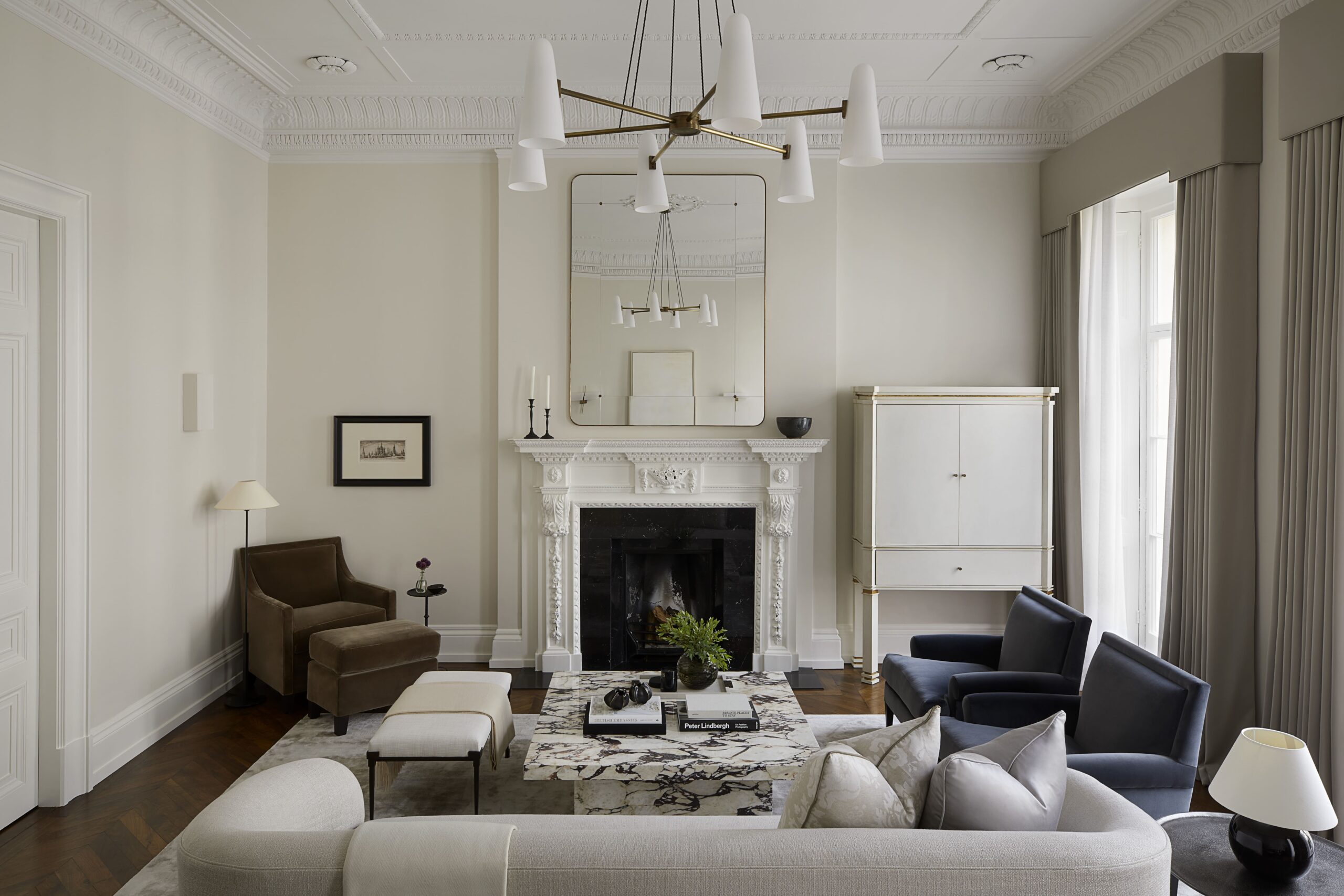
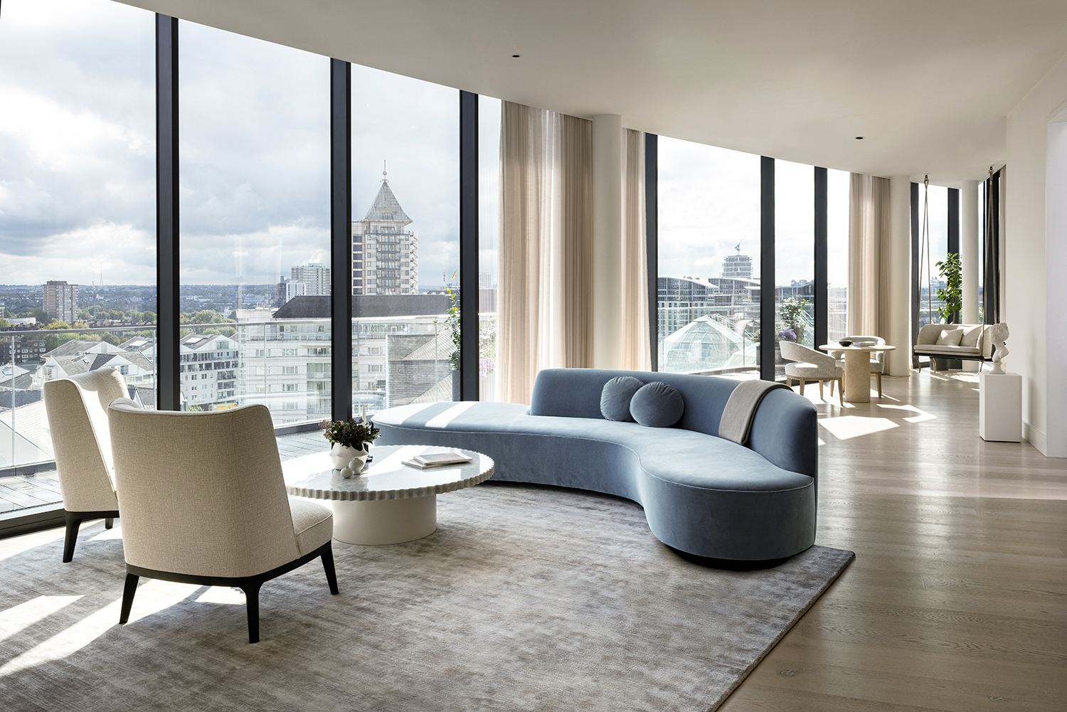
Seating of course is the ultimate decision maker for comfort and also very personal. Most of our upholstery is bespoke so we can tailor the fillings and seat firmness to the exact requirements. If you’re going to showrooms, take time to try them out. The Pillow Sofa by Restoration Hardware is like sinking into a cloud, whereas Italian furniture like Minotti will often have a firmer more structured seat. If you’re not working with a designer, there are still lots of bespoke offerings out there. George Smith furniture has a fantastic range as well as bespoke options for a more classic look. Here we created a bespoke sofa to perfectly fit the space but bare in mind if you’re not using a designer be sure to check access as often the sofa will need to be finished on site to make it fit.
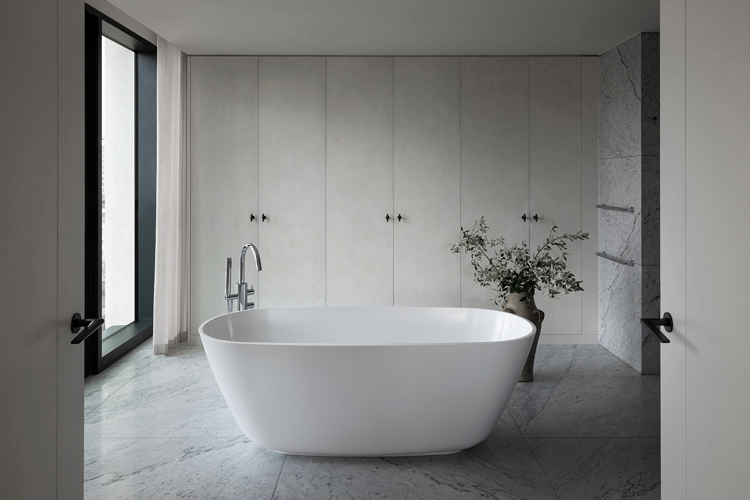
Lastly for us, quiet luxury is very much about calming tones, layered textures and neutral palettes, but I think this very much depends on the client. We often use creams paired with deeper tones to ground the space and relax a space. An all white room can feel clinical so its good to balance the palette. We play a lot with textures in wall finishes and on upholstery to add depth and character to the scheme even though the palette is neutral. Here the cream sofas are paired with a deep chocolate Luxe Velvet Cappuccino by Altfield. To see more of this project click here.
