Elevate Your Space: The Art of Layering Whites
So many of our residential projects are known for being neutral and light. We love to make the most of the architecture and layer with texture and different finishes to add depth. Over the years we have experimented with so many different paint colours and riffs on different shades of white and like most Interior Designers you end up with a few key favourites.
When you decide that you are opting for a white, it’s good to establish whether this a paint you would like to use throughout or just dedicated to key rooms. Equally this will inform your skirting and woodwork choices, which ideally you don’t want to mix up too much throughout the property. I tend to keep all skirting and doors in the same colour throughout unless there is a feature dark room, where I will match the woodwork to the walls.
So, here are a few of our favourite whites and how we pair them with ceiling and woodwork finishes…
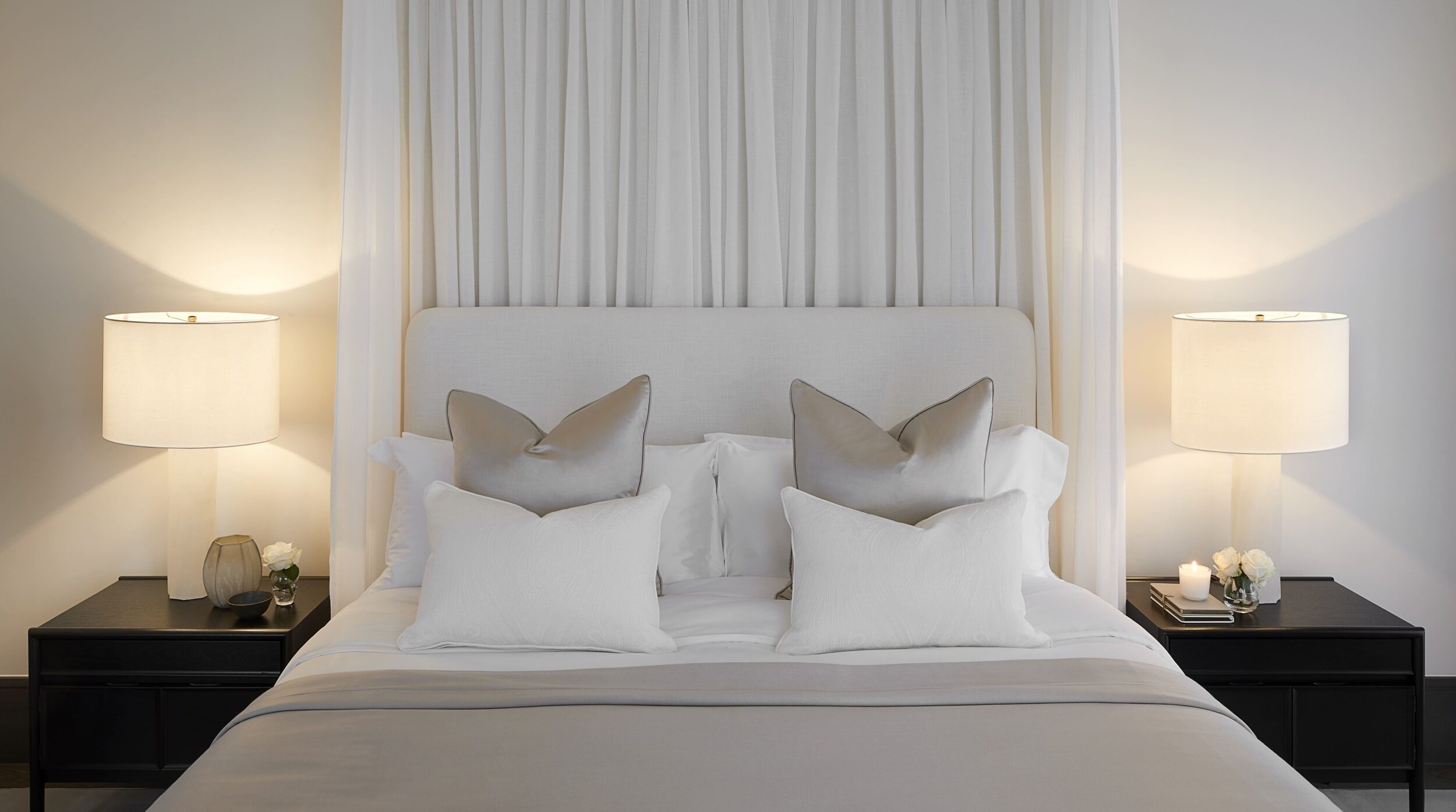
Stone 1 by Paint & Paper Library – this is a fantastic warm white with a slight hint of beige and grey. If your room is north facing it will be more grey and south facing it will be more beige.
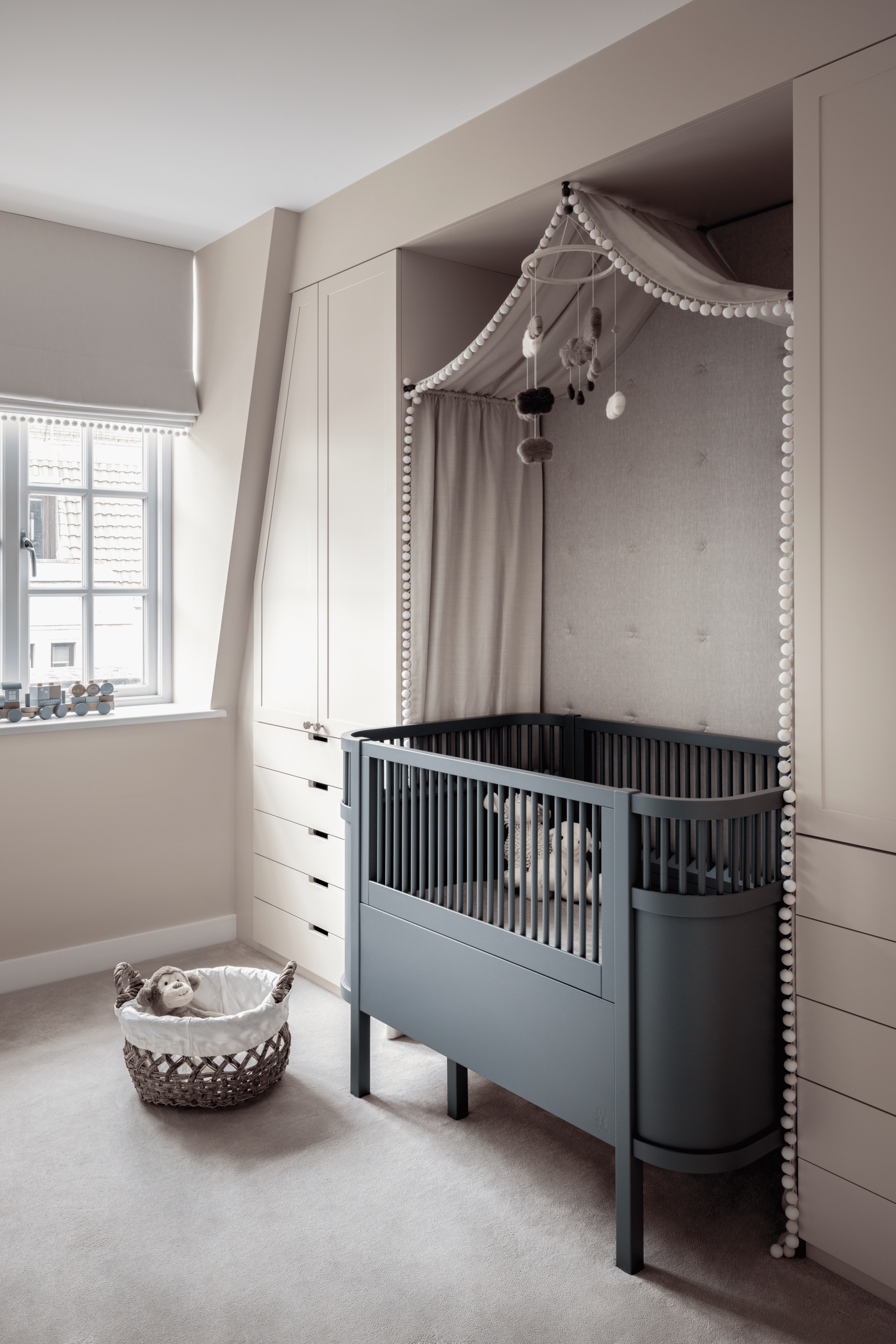
In this nursery, we use it on the walls, skeiling and joinery and opted for a fresh All White by Farrow & Ball to the woodwork and ceilings. This often works better when you have lower ceilings as it gives a sense of height to the space.
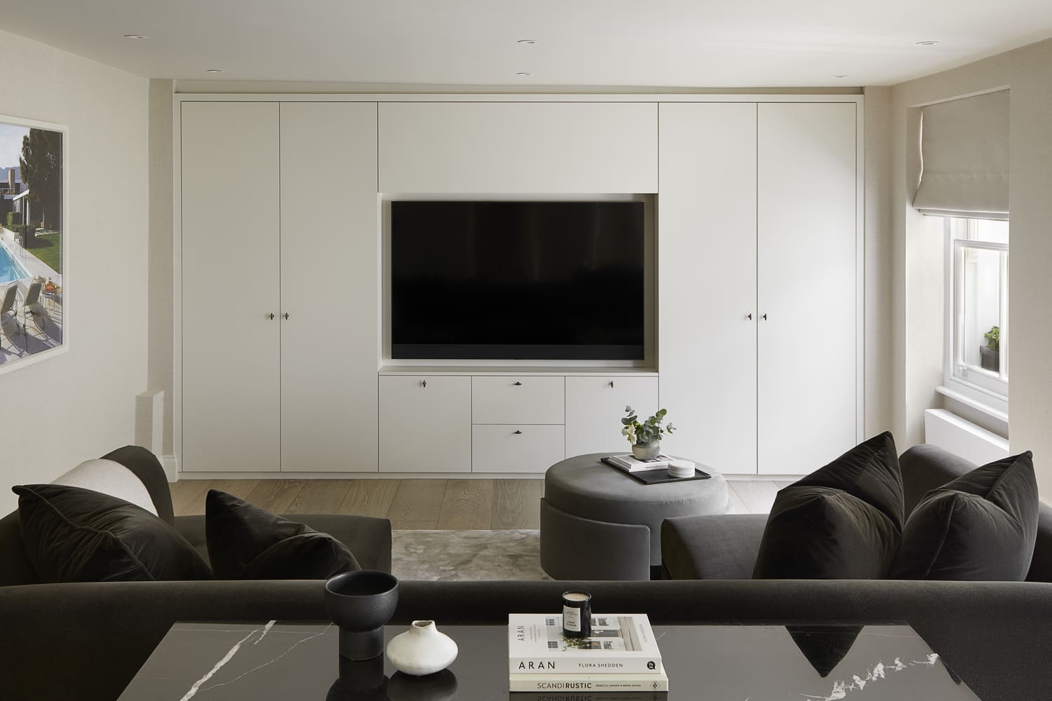
For this media room, we used Shadow White by Farrow & Ball. This has a slight green undertone which worked well with our deep green mohair u-shaped sofa and we painted the ceiling in the same to match, as we wanted this room to feel more cosy.
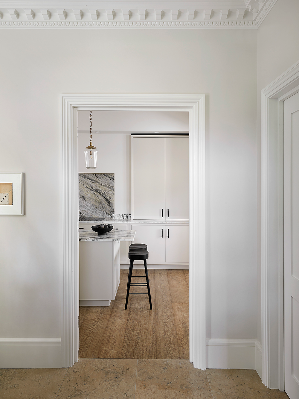
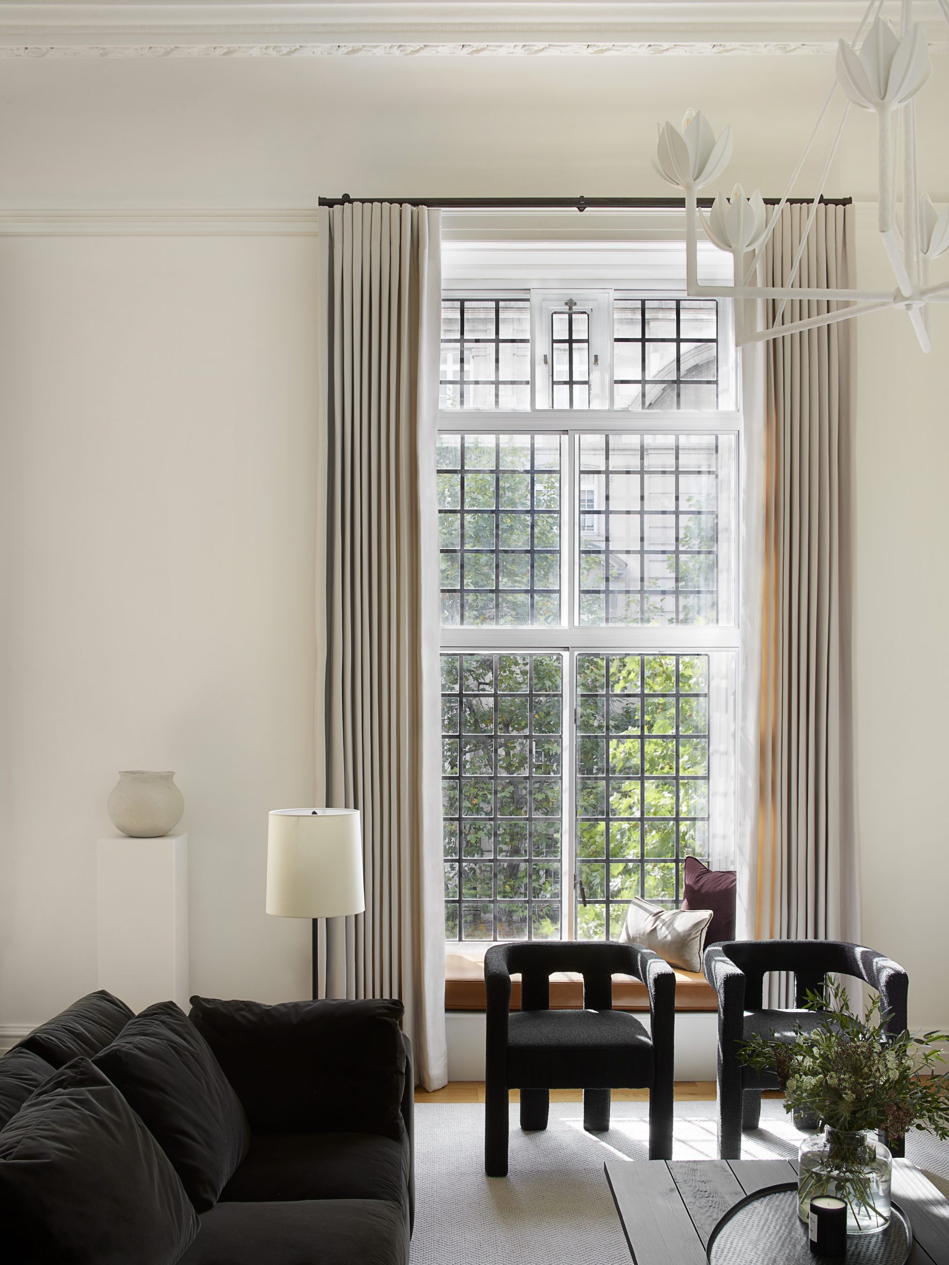
One of our absolute favourites is Chaste by Paint & Paper Library. It is a soft cream without too much yellow in it. When we’re working on heritage properties with high ceilings and intricate cornicing, this can be taken straight onto the ceiling and picks out details beautifully.
A few key tips:
-
Never put all your testers together in a row as the different pigment will throw the true colour of each white. We prefer to have sample boards painted up so we can move them from room to room to see the paints in different lights and so they don’t ‘fight’ with other samples.
-
Look at wall samples with woodwork and ceiling finishes so that you’re happy with them altogether.
-
Budget permitting avoid pure white if you can, it has so much blue pigment, it will always make a space feel cold.
-
Also check out @eyeswoon, she has a full paint reference that’s really descriptive and gives great direction.